Shared Library Dev Guide

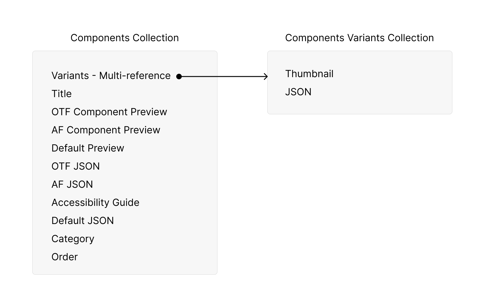
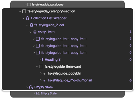
CMS Structure
This is how the current component structure looks.
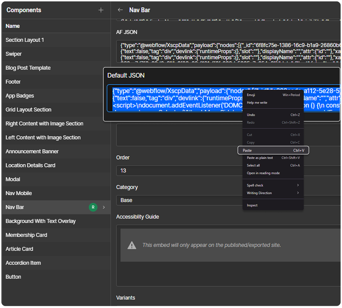
Creating a Component JSON
Steps:
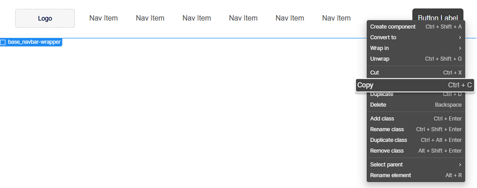
1. Design a component in Webflow and copy the component created.
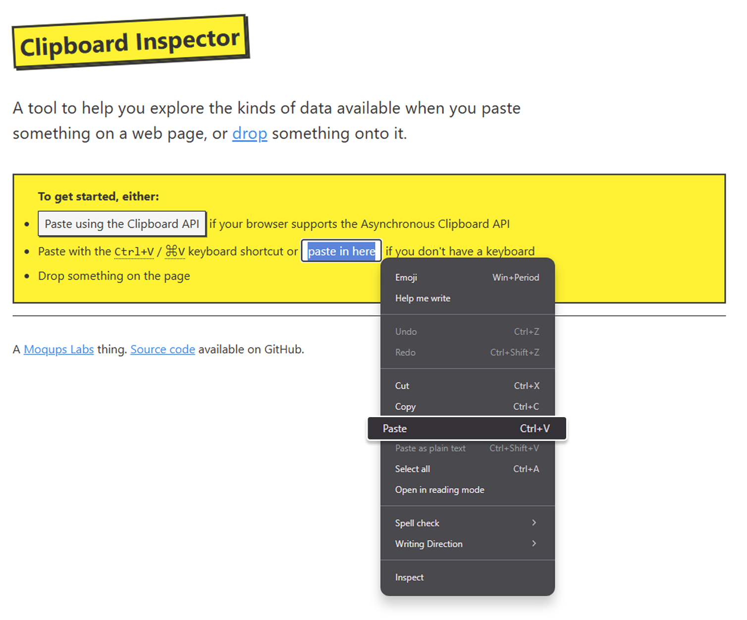
2. Open the Clipboard Inspector site and paste the copied Webflow component to generate the JSON script.
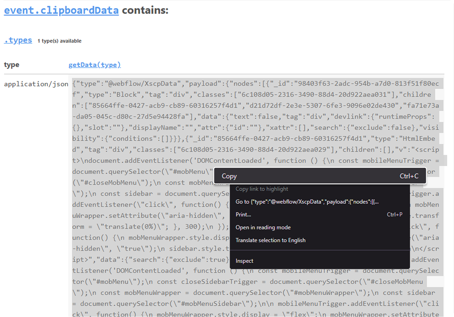
3. Copy the generated JSON script.
5. Add the JSON in the Component CMS, save and publish. Fill out the other fields as well, such as the Component Preview, Category, and Order, to ensure that the new component is properly displayed in the shared library.
Notes:
- Creating a variant follows the same process, but it will be instead placed in the Component Variants Collection.
- Please ensure to add in accessibility guide if applicable. Use the provided table template below and add it in the RichText field through HTML embed. There are already existing accessibility guides in other components that can be used as a reference for the attribute description.
- For new components:
- Add in the appropriate category
- In order field, apply the highest number for that category
- Add in the variants of the component, if applicable
Accessibility Guide
For the accessibility, please use this template to create the table:
<table class="agtbl"><thead>
  <tr>
    <th class="agtd">Attribute</th>
    <th class="agtd">Default</th>
    <th class="agtd">Placed In</th>
    <th class="agtd">Description</th>
  </tr></thead>
<tbody>
  <tr>
    <td class="agtd td-nowrap"><code>attribute name</code></td>
    <td class="agtd">attribute default value</td>
    <td class="agtd td-nowrap"><code>where the attribute is placed</code></td>
    <td class="agtd">attribute description</td>
  </tr>
</tbody>
</table>
The table style is already added in the component page. Strictly do not change the classnames to ensure the table styling is intact.
Component Display
If a new component belongs to an exisiting category, just add the in the appropriate category name in the field and it will automatically reflect in the main page.
If the new component belongs to a new category, the following should be added in the main page:
- new category anchor link
- subcategory anchor links (if applicable)
- new section to display the components belonging to the new section
Step 1: Adding the Main Category and Subcategory Anchor Links
Here are the steps:
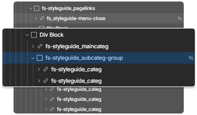
- Locate the
fs-styleguide_pagelinksand add a newDiv Block. The Div Block contains the main category link (fs-styleguide_maincateg) and the subcategory wrapper (fs-styleguide_subcateg-group) that contains a group of subcategory anchor links (fs-styleguide_categ).- Refer to the existing anchor link, copy and paste a new one.
- Refer to the existing anchor link, copy and paste a new one.
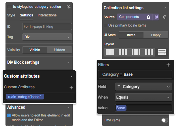
- Once created, go to the element settings of both
fs-styleguide_maincategandfs-styleguide_subcateg-group. In the Custom Attributes, addmain-categ=category_ name. Both elements should have the same attribute and attribute value.
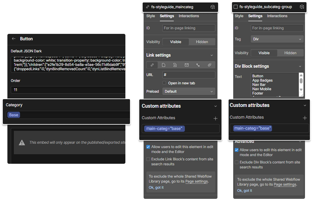
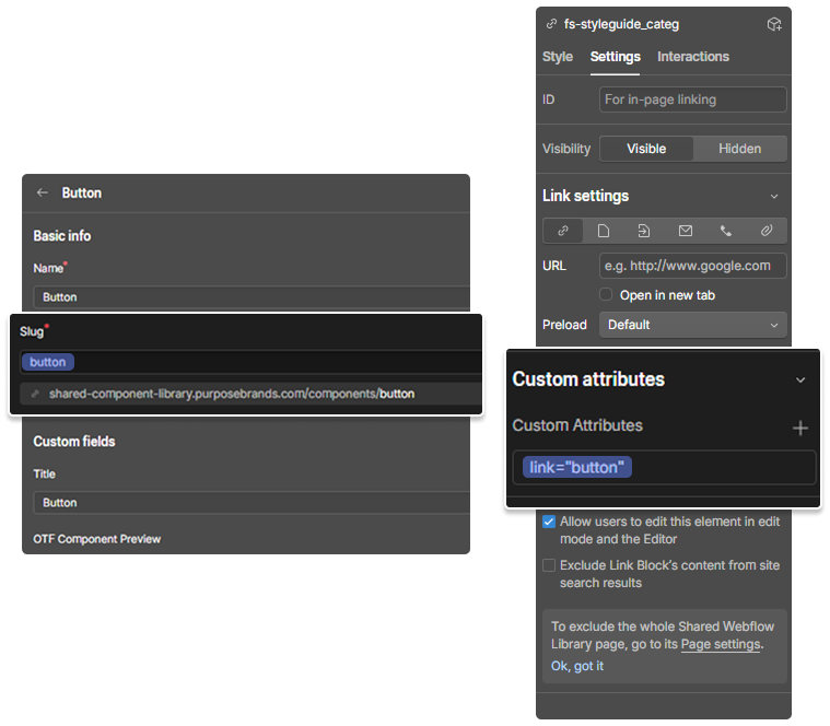
- Go to the element settings of
fs-styleguide_categ. In the Custom Attribute, addlink=component_slug. Ensure that the attribute value matches the component slug that can be seen from the Component CMS.
Step 2: Adding the Section
- Locate
fs-styleguide_catalogueand add a new Div Block and name the class asfs-styleguide_category-section.- Refer to the existing category, copy and paste a new one.
- Go to the element settings of
fs-styleguide_category-section. In the Custom Attributes, addmain-categ=cateogory_name. The attribute value should be the same as the Category Field in the Component CMS.fs-styleguide_category-sectioncontains Component Collection List. Go to the collection list settings and filter the category. The value should be the same as the the category setup on the section wrapper attribute.
After applying the changes, the new category and the components under that should be displaying properly in the main page.
Dev Notes
Code Scripts
The main Shared Component Library page heavily utilizes Javascript to properly display the design utilities and the component library.
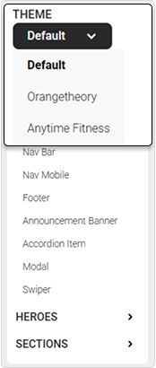
Brand Switching
Click function is added in the dropdown, where it adds a class [ otf-mode | af-mode | default-mode ] in the body tag depending on the selected brand. The classes have a styling setup, where it changes the overall theme of the page.
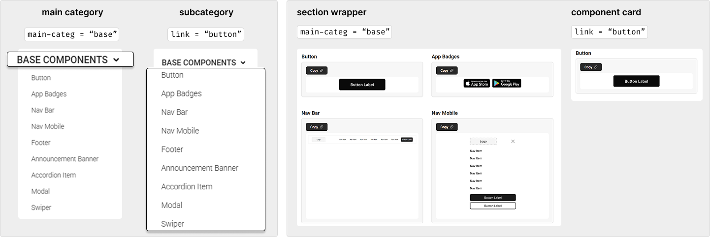
Displaying the Component Library
Custom attributes are utilized to be able to query select the appropriate category and brand based on the selected link in the navigation. The following attributes are [ main-categ | link ]. The main-categ attribute is used to display the correct category, while the link serves as the scroll anchor link. Both the anchor link and the section wrapper should have the same main-categ attribute values to match what to display in the page. The link attribute is added on the component card for easy anchoring.
Code comments are provided in the page script for better understanding of the overall functionality of the page.
Testing the Component
Please ensure to test out the components, including its responsiveness. Preferably, test out the component to a different project just to ensure that the styling is still intact.
Limitations
The shared library uses a copy-pasting method. This implementation limits the use of component props and variants when creating a component as it will not be copied when placed in the clipboard inspector. Hence, for component variants, it will have to be created individually.